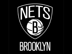
Black-and-white crest is ‘a throwback to Brooklyn and what we’re about,’ Jay tells MTV News. By Rob Markman Brooklyn Nets’ logo Photo: NBA Jay-Z once fancied himself the black Branch Rickey, the man who broke the athletic color barrier and signed Jackie Robinson to the Brooklyn Dodgers in 1947. Sure, Hov used poetic license when he spit the line on 2009’s “Brooklyn Go Hard,” but now that Mr. Carter is part of the brain trust that will transplant the NBA’s Nets to his native BK, the God MC has surely changed the game. At the end of April, the Brooklyn Nets unveiled their new logo, a Jigga-approved black-and-white crest, which bucks the flash and pizzazz typical of most NBA logos these days. “I wanted to make it really classic and strong; a throwback to Brooklyn and what we’re about,” Jay told MTV News on Monday after his press conference where he announced his upcoming two-day Made in America music festival in Philadelphia. Since his 1996 debut album ( Reasonable Doubt ) Jay has stood as an ambassador for New York City’s largest borough. Though the music mogul has gone on to acquire life’s finer things, through songs like “Brooklyn’s Finest,” “Where I’m From” and his #1 hit “Empire State of Mind,” Hova has always rapped about the darker side of his hometown as well. The struggle eventually breeds strength and it was the strength that Jay hoped to capture in the new Nets design. “It’s real gritty and we’re not about flash — well, sometimes,” he said with a brief pause. “Just the roots of Brooklyn as this very bold, strong, simple logo” When the NBA’s Seattle Sonics franchise moved to Oklahoma in 2008, the team was rechristened the Oklahoma City Thunder and was branded with a new color-filled logo fit for post-millennium basketball. With this new Nets move, Jay-Z and Nets brass looked to the past in order to ensure the team’s place in the future. Vintage New York transit system signage served as their chief inspiration. “It was really a take off the old subway signs, if you look at the old subway signs they were in black and white. It was that strong, beautiful, iconic black and white,” Jay said. “I wanted to pick something that would stand the test of time and be here forever.” What do you think of the new Brooklyn Nets logo? Tell us in the comments!

Read more here:
Jay-Z Used Old Subway Signs For New Brooklyn Nets Logo


Leave a Reply